 |
This page is an archive. The contents have been moved from another page for reference purposes only, and should be preserved in their current form. Discussion or voting on this page is not current. Any additions you make will probably not be read.
|
Puff Daddy
| Please Help this Picture
|
Puff Daddy, although one of rap music's foremost contributors in the '90s, is now being accused of having "gone soft." Image credit: Necropaxx
Nominate - discuss this image
|
|
I want to VFP this idea, but are my chopping skillz up to it? Is the idea up to it? Would it look better w/ or w/o the mouth and eyes? What needs to be fixed? Do I ask too many questions? • • • Necropaxx (T) {~} 01:55, Nov 19
- Either the face bits are crooked compared to the bottom of the 'mallow, or the top is crooked, or something is crooked, and he casts a shadow, but his hands don't. That's got me trippin', yo. Sir Modusoperandi Boinc! 05:35, 19 November 2008 (UTC)
- How's this? • • • Necropaxx (T) {~} 21:08, Nov 22
- A little better. It's not really recognizable as Puff Daddy. Have you tried using more of his face? Keep in mind, of course, that I have little to no idea who he is. He's one of those rapping musicians, right? Does he do the hip hopping? Sir Modusoperandi Boinc! 21:14, 22 November 2008 (UTC)
- Yes, he is. For the pic, I didn't use his face at all--just a token black guy. I didn't think it would matter, as the crux of my joke is making fun of ridiculous rapper names. Anyway, how are you feeling about adding... wait for it... "Bling." Also, that was really fast response time! • • • Necropaxx (T) {~} 21:34, Nov 22
- Yeah. I'm being held prisoner in a computer factory. On the plus side, Friday is Hawaiian shirt day. Sir Modusoperandi Boinc! 21:52, 22 November 2008 (UTC)
- Yes, but what about the image? • • • Necropaxx (T) {~} 21:53, Nov 22
- There's an image? Why wasn't I told of this? Outrage! Sir Modusoperandi Boinc! 21:54, 22 November 2008 (UTC)
- Revolution! Vive la France! Either we must hang together or we shall all hang separately! ... Fo' shizzle! • • • Necropaxx (T) {~} 22:13, Nov 22
- Canada's example is better. Wait until Britain is distracted by how Great it is, then ask politely. Sir Modusoperandi Boinc! 22:27, 22 November 2008 (UTC)
- All right. I'll nom this and see how it does. If it gets featured, great; if not, I'll just curl into a ball and die. • • • Necropaxx (T) {~} 16:08, Nov 24
Norman Mockwell
| Please Help this Picture
|
Before getting into advertisements depicting romanticized American life, Norman Rockwell dabbled in the production of ransom notes. This piece was for a business acting as a front for a leftist military organization under the pen name "Mockwell". Image credit: PaddyAtkinson
Nominate - discuss this image
|
|
Your thoughts, o masters of the pixels?--PaddyAtkinson 17:33, 7 November 2008 (UTC)
- Amusing. The "M" in Mockwell looks kind of off (I take it that it's the N copied and mirrored). The concept would work well enough with his real name if you can't find a proper capital M. Sir Modusoperandi Boinc! 17:46, 7 November 2008 (UTC)
- Just tried doing a different style M. any better or would you you suggest sticking with the R?--PaddyAtkinson 21:06, 7 November 2008 (UTC)
- The new M is better. Sir Modusoperandi Boinc! 21:18, 7 November 2008 (UTC)
Concentration
This was hard to make on paint, as my computer turned brown when I finished. it looked like Poo.(the computer) --MMM 19:15, 18 October 2008 (UTC)
- First, that's pretty good for MSPaint. Second, don't use paint. Third, it's "jaggy" and could use some antialiasing, which it can't have because you used MSPaint, which doesn't do it. Do you see a pattern? Sir Modusoperandi Boinc! 19:22, 18 October 2008 (UTC)
- ...Wait a minute...Wait a minute...Ah. Now I see it. sorry about that, I would have done better if I'd noticed...It's hard when your only program is Paint...Thank you for alerting me to this, I will attempt to fix it.--MMM 19:31, 18 October 2008 (UTC)
- If you view it closely li looks like a SVG image.—Flutter (Talk•Games•Fun Pages•Awards•Help) 01:47, 31 December 2008 (UTC)
Minesweeper
--Hippo666 06:04, 23 September 2008 (UTC)--
- I'm not sure if I should change the caption and/or make it smaller. Any ideas? --Hippo666 06:05, 23 September 2008 (UTC)
- Make most of the bottom text smaller and, unless you're trying to use repetition for comedic effect, avoid repetition (and shit, mother fucker). Also, it's "Fuck your friends and family. You want this mother fucker" or "Fuck your friends and family, you want this mother fucker". Obviously. Sir Modusoperandi Boinc! 07:04, 25 September 2008 (UTC)
- Holy Jesus, the quality is pretty bad, but you can't do anything about it, can you?—Flutter (Talk•Games•Fun Pages•Awards•Help) 01:42, 31 December 2008 (UTC)
- Oh and its pretty funny too, considering the raw profanity jokes—Flutter (Talk•Games•Fun Pages•Awards•Help) 01:43, 31 December 2008 (UTC)
Fake photo revealed
| Please Help this Picture
|
Thanks to advanced computer enhancing on a photograph posted on the net it was revealed last night that the latest wave of Delta shaped UFO's being reported across the country is yet another hoax perpetrated by the giant flying turtles. Image credit: VitalOd
Nominate - discuss this image
|
|
--VitalOD 23:45, 29 August 2008 (UTC)--
- It doesn't really need the "fake" paste-on. Maybe a date/time thingy in one corner on both before and enhanced pics, like a camcorder, instead? Other than that, nothing comes to mind. Sir Modusoperandi Boinc! 18:41, 31 August 2008 (UTC)
OK , working on it. I was thinking of producing a whole series of 'giant flying turtle' ufo hoax pics to make up a whole article.
- on another note do ya think its possible to get that ninja chopper award i got for the protips section over to my current username i had some great comments on my old vitaloverdose page now ive got nothing! Im so depressed >.< and if that wasnt bad enough i just got banned for a week for trying to cheat on the vfp's votes by logging out and voting as a guest..when i reality i was unable to log into my account and was just replying to a comment not voting. god dam it ! im so misunderstood .lolol--VitalOD 04:18, 14 September 2008 (UTC)
- "...do ya think its possible to get that ninja chopper award i got for the protips section over to my current username..."
- - Did you chat with Sannse about getting your password to the old account? Failing that, she can run a check to make sure that you're both the old you and the new you. You can say that the new you is the old you, but until you can prove it...
- "i just got banned for a week for trying to cheat on the vfp's votes by logging out and voting as a guest..when i reality i was unable to log into my account"
- - Which page was that? Sir Modusoperandi Boinc! 04:31, 14 September 2008 (UTC)
- [this page]
- Thanks for the advice by the way :) . I think ive worked out whats going on. Conformation emails are no being delivered if i register with my vitaloverdose@yahoo.com so i havent been able to email anyone so far even on the new account i made as VitalOd. Ive fixed that now so ill be able to email her. --VitalOD 14:48, 14 September 2008 (UTC)
Nascar Turtle
| Please Help this Picture
|
And rounding the final corner of the first NASTAR (National Association of Stock Turtle Animal Racing) turtle race, racer 20 Turtle Stewart takes first place! Image credit: Readmesoon
Nominate - discuss this image
|
|
I need some help for this picture, mostly touching up the number. Anyone feel free to help. ~ Readmesoon
- What program are you using? Functions such as Photoshop's liquify might be a good option to make the number better match the turtle shell surface. --monika 23:46, 24 August 2008 (UTC)
- Thanks! But uh... where exactly can I find that on PhotoshoP? I suck with image manipulation. ~ Readmesoon
- It should be in filters. It's one of the more complicated things photoshop does, so expect to spend a bit of time getting frustrated. But here's how I'd go about it.
- 1. Make a blank layer and draw on it with a bright pink pen curves along the turtle's shell that should correspond to straight lines on any decals stuck on the turtle. This is for your reference.
- 2. Go into liquify and make yourself a huge brush. Select the option on the side that looks like an egg with spikes coming out of it. Put the pen down so that the number is near the edge of said huge pen, and hold down until the number seems curved the right amount.
- 3. Go back to normal mode and use transform to get the number approximately lined up to the turtle.
- 4. Go back to liquify. Use the tool that looks like a brush painting the Japanese flag and a small brush size to mark off a small polygon about the same size as a facet of the turtle shell. (Mark around this shape, leaving it clear and the rest of the image purple.
- 5. Use a smaller pen and select the tool that looks like a finger pushing something. Use this to shift the shape thingie you made a little.
- 6. Clear the mask by clicking the none button and repeat from 4 to make more facets until it looks right.
- Hope that helps. --monika 00:02, 25 August 2008 (UTC)
- Well, I can't do it. It's too complicated. Perhaps you can?~ Readmesoon
- More simply (but potentially less goodly), just copy the background layer, move it on top of the "20" layer and play with its transparency/brightness/contrast until it looks right. Maybe try rotating the 20 layer clockwise a bit (10-15 degrees, maybe), too, before you do that.
- Also, as per your comment, this is Reefer Desk. We help. You do. Sir Modusoperandi Boinc! 02:01, 25 August 2008 (UTC)
You sure thats a turtle?--VitalOD 01:28, 30 August 2008 (UTC)
Ex-Priminister Blair takes up gardening
- That's the strangest bong I've ever seen. It looks like a whip cream dispenser. Any why's he deep-throating it? Sir Modusoperandi Boinc! 19:27, 20 August 2008 (UTC)
- its a Peak flow meter for asthematics.He was on a hospital visit at the time. I sooo wanted to go for the more obvious modification to this pic.lol but it would be a waste of time , nowhere would display it. ;)--84.45.226.149 06:33, 22 August 2008 (UTC)
- Really nice image, love the shadow on his suit. If you can come up with a quality description for this I can see it doing well on VFH. -- Sir Mhaille
 (talk to me)
NWO
--VitalOD 17:30, 18 August 2008 (UTC)
- Actually, with a perfect caption to provide context, that would be the best thing ever. I shit you not. Well, maybe a little. Sir Modusoperandi Boinc! 21:01, 18 August 2008 (UTC)
- Thanks. I nominated this for the VFP out of repect for your judgement (plus if it doesnt make it i can allways say' see i knew it wasnt good enough. God dam it!') --VitalOD 04:24, 14 September 2008 (UTC)
- I do like it. I just try to avoid voting on VFP on pics that have run through here. This page is to improve quality. That page is whether I like it or not. The two do not necessarily go together. Sir Modusoperandi Boinc! 04:34, 14 September 2008 (UTC)
- ah ha! noted :) --VitalOD 14:22, 14 September 2008 (UTC)
- I agree, it only needs a caption.-- Style
 Guide 14:26, 27 September 2008 (UTC)
Men At Work
thinking i might take a VFP run. whaddya think modus, funny enough / ways to improve quality? SirGerrycheeversGunTalk 21:26, 17 August 2008 (UTC)
- You need to find higher resolution base pics. This one is all pixely. High res pictures shrunk down look better than low res ones in all their low resness. Maybe saving as PNG would help avoid some of the artifacting, most noticeable in the "orange" areas (JPGs can be really artifacty). The man & desk don't have cast a shadow on the ground. That means that both are vampires. Don't say I didn't warn you. The sign might work better in the pictographic style, rather than as a direct copy of the man/desk (if you can draw real goodly, that is. Yes, "goodly" is a word. No, I don't care what your English teacher thinks).
- I don't render opinions here on how well pics would do on VFP. I'm not psychic.
- Lastly; you're Australian, right? I know this because I'm psychic. Seriously! Sir Modusoperandi Boinc! 22:12, 17 August 2008 (UTC)
- hmm yea, it seemed like everytime i saved the image more pixel-ness would creep into it. i'll try again with different base images i guess. also: boston, mass., USA. SirGerrycheeversGunTalk 14:51, 18 August 2008 (UTC)
- Oh. Then why is the sign on the wrong side of the road to protect the man? Hmmmm? I knew you were Australian. The sooner you admit it, the sooner you can get on with your life. Sir Modusoperandi Boinc! 20:59, 18 August 2008 (UTC)
- silly modus, i'm just terrible at driving. i'm as american as apple pie. why, just look at this football here! wait a tic...a rugby ball!? no! it can't be!!! SirGerrycheeversGunTalk 03:07, 19 August 2008 (UTC)
Dining in Hell
- Ah...the joys of trying to get multiple different source images to match... See how Chuck's "black" is "more black" or "blacker" than the painting's "black"? Play with the brightness/contrast of...everyone except for Freeman and Jesus...until they "fit in" better (the same goes for the Hell in the window. It's "red" is redder than, say, the "red" on the second person from left). The Joker is bald on one side of his head. If you can't find a Joker pic that's both the right angle and has hair on both sides of his head, you can "clone" the hair, mirror it, and place it behind the Joker. You'll have to move it around a bit until it looks right. As for the text, set it to be 80-95% opaque (so that it fades a bit in to the painting, rather than appearing as printed on over it).
- Lastly, why does the third from right guy look like that guy from Friends? Freaky. Sir Modusoperandi Boinc! 22:03, 17 August 2008 (UTC)
Auk Cannon
I'm not sure if i want to VFP this picture, I just want to know what people think right now --Auk 07:12, 15 August 2008 (UTC)
- The picture is too small. There isn't much more I can say, until the pic is big enough to critique. Sir Modusoperandi Boinc! 19:32, 15 August 2008 (UTC)
- That's one big bird. -- Hindleyite Converse 12:21, 20 August 2008 (UTC)
Jesus is back
i know , i know i should have put Nixon in there to .lol--Vitaloverdose 14:20, 5 August 2008 (UTC)
- Giant Jesus is faded compared to the other guys. Alternately, the smokey fire is the opposite of too faded. One of those. Probably the latter. Sir Modusoperandi Boinc! 16:48, 5 August 2008 (UTC)
>.< ive lost my dam password. Ive tried clicking the button to send it to my email but nothings happening, i checked my filters for my email and they are turned off. Any idea what can be done or who to speak to? - Vitaloverdose vitaloverdose@yahoo.com --84.45.226.149 00:40, 17 August 2008 (UTC)
- Sannse. She's the Boba to our Fett. Sir Modusoperandi Boinc! 01:03, 17 August 2008 (UTC)
- hmmm not a lot happening there. think i might just re-register as VitalOD for now.
- Jesus doesn't look pissed. Can you fix his eyes on the guys and work his expression? The idea works, I think, so spend some time with the contrasts etc. -- Style Guide 14:31, 27 September 2008 (UTC)
Crowley Rev4
- Think i got it right this time --Vitaloverdose 20:48, 2 August 2008 (UTC)
- I think that you need to move on. Your Crowley/vibrator fixation is getting more than a little creepy. Sir Modusoperandi Boinc! 21:12, 2 August 2008 (UTC)
Evil_George_Bush_Senior
- Just having some fun with this.. pleased to hear comments :)--Vitaloverdose 05:37, 25 July 2008 (UTC)
- It's kind of evil. It'd be more evil if he had bad teeth. That's how you know people are evil. Then you lynch 'em. Sir Modusoperandi Boinc! 03:32, 26 July 2008 (UTC)
- You did this? It's awesome, works just as well without the teeth but it would make a nice finishing touch - that bit more evil. Plus, maybe crop the top and bottom a little bit. -- Hindleyite Converse 18:07, 27 July 2008 (UTC)
- So do i just re-upload the pics under the same filename to overwrite the old ones??--Vitaloverdose 11:50, 28 July 2008 (UTC)
- Yes. Alternately, upload them under a different name, and list the old version on QVFD. Or, if you prefer, print them out and just stick them to your monitor. Sir Modusoperandi Boinc! 17:29, 28 July 2008 (UTC)
Bush's new war on drugs
| Please Help this Picture
|
George Bush reavealed his new plan for a war on drugs, when asked for further details he became distant and then claimed to have forgotten what he was talking about Image credit: Vitaloverdose
Nominate - discuss this image
|
|
- ..what a cool job.. pleased to hear comments :)--Vitaloverdose --Vitaloverdose 01:05, 25 July 2008 (UTC)
- Dude, if he's smoking a spliff, why isn't it lit? Sir Modusoperandi Boinc! 04:45, 25 July 2008 (UTC)
- It was when i took the pic, if it didnt show up then so be it.--Vitaloverdose 04:56, 25 July 2008 (UTC)
- He can't be smoking reefer if the reefer isn't smoking, right? Sir Modusoperandi Boinc! 05:05, 25 July 2008 (UTC)
- its kinda hard to hold a joint for a pic AND be sucking away at it at the same time.Its normal for pics to be like that..go and have a look at any smoking advert. You hardly ever see a hot lit ember. --Vitaloverdose 05:13, 25 July 2008 (UTC)
- er.. came out the end as the joint went out? lol . maybe thats why hes sucking so hard, he hasent noticed.--Vitaloverdose 05:28, 25 July 2008 (UTC)
- I reckon it needs some smoke to complete the picture. Would it also be possible to add a bit of a glazed look in Bush's eyes? -- Hindleyite Converse 18:17, 27 July 2008 (UTC)
- Not really because he's kinda frowning but i could give him some of the old 'red-eye'.
George Bush fights off alkieda 'Scanner's attack'
- ..usin his big brain.lol.. pleased to hear comments :)--Vitaloverdose 00:28, 25 July 2008 (UTC)
- The joke is all in the caption, but I didn't initially see the 'chop. The only oddity I see is the shadow betwixt head and neck. It's darker (and bluer) than the other shadows. He is missing his neck, too, but I don't know how much you can do about that, depending on the source images for the headswap. Sir Modusoperandi Boinc! 04:44, 25 July 2008 (UTC)
- Its not a headswap ive increased the size of his head by 8% and tinted it red.--Vitaloverdose 04:50, 25 July 2008 (UTC)
- 8%? You do know that humans have trouble distinguishing differences of 10% or less, right? That I didn't see it's tinting means that it needs more of it. Sir Modusoperandi Boinc! 05:04, 25 July 2008 (UTC)
- yeah id agree--Vitaloverdose 05:34, 25 July 2008 (UTC)
- It'd be good if you made Bush's brain larger, almost to the point of explosion maybe. Plus he might need some steam coming from his ears or his hair starting to smoke... might give it a bit more impact. Is it me or do his Bush's ears seem a bit pointy? Don't know if it's the 'chopping or if his ears are like that anyway. -- Hindleyite Converse 18:14, 27 July 2008 (UTC)
OL.E.PRO
- I cooked/cocked this one up as something to bolster our flagging VFP but I think it's missing something. Any ideas? Thoughts so far?
 (Bonner) (Talk) Jul 8, 20:49
- Jokes about buggery? Actual buggery? As for my thoughts, I do get it, but it's too in-jokey. No one here has heard of Olipro except for you and I. Now, if it was Modusoperand-E, that would be a pic that the whole world would love. Sir Modusoperandi Boinc! 21:00, 8 July 2008 (UTC)
- Yeah, that was a concern of mine; the whole in-joke scenario. I'll work with it a little more and try and get some reference to buggery in there through innuendo maybe. That could add to it's humour quality and make it funnier to a larger audience. (Bonner) (Talk) Jul 8, 21:08
- I added moar dildos and dropped them in a box for added effect. (Bonner) (Talk) Jul 9, 11:32
- Erhm, one of them needs to look like the "rabbit" Dame
 GUN PotY WotM 2xPotM 17xVFH VFP Poo PMS •YAP• 15:35, 9 July 2008 (UTC)
- The "rabbit"? (Bonner) (Talk) Jul 9, 19:11
- you need to git r done Dame GUN PotY WotM 2xPotM 17xVFH VFP Poo PMS •YAP• 19:45, 9 July 2008 (UTC)
- ...don't know what a rabbit is...*grumble*...kids these days. Sir Modusoperandi Boinc! 19:48, 9 July 2008 (UTC)
- Ahh I see, Will do. And Modus, I can't say I spend my free time looking for/ordering dildos and vibrators on the internet. I guess I can't speak for everyone when I say that... (Bonner) (Talk) Jul 9, 19:59
- Mom had one. I thought it was a lightsaber. I got some shocked looks from people that Halloween, let me tell you. Sir Modusoperandi Boinc! 20:23, 9 July 2008 (UTC)
- How about a small tub of vaseline on the floor complete with shadow. -- Sir Mhaille (talk to me)
Happy Reaper
- Would this be VFP-able? Is there a better caption out there that I'm not seeing? Thanks! • • • Necropaxx (T) {~} 20:02, Jul 8
- There's a pixelated, white band around the mouth, and the mouth's black is blacker than the background pic black. Brighten up the mouth until the blacks match (and be glad it's only brightness matching and not colour matching). I don't give opinions on VFPability, as I really have no idea what will pass and what won't. I'll pitch in a caption if anything comes to me, as the current one doesn't do it for me. Just so we're clear, by "it" I mean "orgasm". Sir Modusoperandi Boinc! 20:58, 8 July 2008 (UTC)
Killer Robot Janitor
I originally made this for the B4 article, but thought it came out very well. I wasn't sure if it was ready or not to be suggested for featured image yet, however, as it's my first time doing so. Your thoughts on the matter? Is it ready to be nomimated or does it need something? --Lamoxlamae 06:52, 16 June 2008 (UTC)
- You can try colouring the bristles as brass or copper. That's totally roboty. Sir Modusoperandi Boinc! 07:06, 16 June 2008 (UTC)
- This is cool. It works fine. -- Hindleyite Converse 18:03, 27 July 2008 (UTC)
Aleister Crowley rowing his boat "Golden Dawn" in a plate full of porridge
I, err -- well, I had this "idea" and I think it came out quite good, actually. At least I think it's rather nice. //  Berry; speak to me // 22:55 13 June 2008
- Lower the contrast a bit on him and the boat (see how him/top of boat is mostly white, but the background pic is mostly grey?). Maybe blur him/boat a smidge (it's sharper than the background pic). Lastly, WTF? Sir Modusoperandi Boinc! 23:41, 13 June 2008 (UTC)
- I think I've done what you told me to. Regarding your question, your guess is as good as mine. // Berry; speak to me // 00:13 14 June 2008
- No. You did the whole picture. I just meant man-boat (see how it "pops" more than the background pic?). Man-boat was a detective series in the 70s, by the way. It was about a man who, after being exposed to seawater, became half-boat. Also, people say that I make things up, sometimes. Sir Modusoperandi Boinc! 00:20, 14 June 2008 (UTC)
- I don't know if you agree with me but I think it looks slightly better now. // Berry; speak to me // 00:49 14 June 2008
- Sure. He's boating in beans. That's my gig, baby. Sir Modusoperandi Boinc! 03:55, 14 June 2008 (UTC)
- Thank you for your help. // Berry; speak to me // 09:53 14 June 2008
- Help? Here? Me? Question mark? Sir Modusoperandi Boinc! 10:04, 14 June 2008 (UTC)
Releasimification Society
I made this picure for an article I created called Releasimfication, and I thought it was kinda funny actually.-Bobofosho2 20:53, 13 June 2008 (UTC)
- It's a bum. The page seems to be about soultrain, not spanking. Am I confused, or is that rumpshaker I hear on the radio? Aw, yeah. Sir Modusoperandi Boinc! 21:34, 13 June 2008 (UTC)
- I don't get it... but I like it. -- Hindleyite Converse 18:09, 27 July 2008 (UTC)
Cemetery bed
I made this for necrophiliphobia. It's okay, but doesn't quite look right and I don't know how to change that. -- 15Mickey20 (talk to Mickey) 16:17, 12 June 2008 (UTC)
- Getting two different pictures to line up perfectly is luck, mostly. The bed was taken at "this" angle, see?...while the graveyard was at "that" angle. Personally, I'd have gone with a regular bed-shaped bed, if only to make it more quickly recognizable as such. That's how I roll. Also, I dress as a vampire sometimes, but I say "wam-peer". The secret is to roll the "r". Sir Modusoperandi Boinc! 17:37, 12 June 2008 (UTC)
- The bed is too high of contrast for the surrounding image. Crank down the contrast, and try some color variations and hue adjustments to tweak. XlacidaR (Holla!) 16:03, 31 July 2008 (UTC)
Hilbama
Yea, so there it is. Ive spent too long looking at it, cant tell if there are any mistakes. Also, does the caption work? I was thinking of something else along the lines of Hilary finally found a way to get on the ticket. --Ithsword 18:01, 10 June 2008 (UTC)
- Creepy. That's all I have to say (besides the unfortunate fact that I've seen Hilary/Obama face swaps before). Sir Modusoperandi Boinc! 22:44, 10 June 2008 (UTC)
- Yea, I was worried about that...but has it ever been tried to be featured? --Ithsword 18:31, 11 June 2008 (UTC)
- The one that I saw? That was somewhere else. My dreams, probably. *swoon* Sir Modusoperandi Boinc! 18:38, 11 June 2008 (UTC)
- I see...Cursed dreams. More of a nightmare if one sees that. But anyways, no really big things wrong with it? Is it feature worthy? --Ithsword 18:42, 11 June 2008 (UTC)
- Well, the hair doesn't look natural. Like, it's too far back on the head, and doesn't come over in a natural hair-like swoop. Other than that it looks fine, even though I think we're pretty much tired of Obama/Hillary jokes here. But you can give it a shot. -RAHB 18:53, 11 June 2008 (UTC)
- Or rather I guess it's the other way around. Move the Obama face more to the right-ish. -RAHB 18:54, 11 June 2008 (UTC)
- Well, as is common with face swaps, the two pictures weren't taken at exactly the same angle, so the combination is a bit warped, though not a 'chop killer, IMO. You could trim off a bit of his jawline (see how the part of the jaw on the left side of the picture, his right, "bulges" a bit?). As for your last question, I don't give advice like that. You see, I have terrible taste. My shirt: paisley. My pants are paisley too. Shoes, as well. I think I've got a theme going. Sir Modusoperandi Boinc! 18:56, 11 June 2008 (UTC)
- Try putting the Obama layer on a lighter opacity. Then move the facial features around a little to make them line up closer with hers and it might work better.--Lamoxlamae 06:55, 16 June 2008 (UTC)
Irony Man
| Please Help this Picture
|
Once Tony Stark realized that the only way to save himself from alcoholism was to play the role of Robert Downey Jr, the irony was devastatingly apt. Image credit: [[User:--Nytrospawn 02:32, 3 June 2008 (UTC)|--Nytrospawn 02:32, 3 June 2008 (UTC)]]
Nominate - discuss this image
|
|
Heres something I farted out --Nytrospawn 02:32, 3 June 2008 (UTC)
- If you can, zoom out and add a popping thought balloon. Sir Modusoperandi Boinc! 02:34, 3 June 2008 (UTC)
What sort of non sequitur should Tony Stark be saying or thinking? --Nytrospawn 23:20, 3 June 2008 (UTC)
- It doesn't really have to be anything, just a bursting thought balloon. Sir Modusoperandi Boinc! 23:29, 3 June 2008 (UTC)
Magna Cappa
| Please Help this Picture
|
In about 1573, English nobles forced the king to sign the now-famous document, limiting the king's special privileges to the top hat. Image credit: Necropaxx
Nominate - discuss this image
|
|
- Is this funny? Is it VFP-able? Is the caption okay? Can anyone hear me? • • • Necropaxx (T) {~} 00:58, Jun 3
- The hat is too dark. Fade it out a bit to match the background. It's got a visible white edge, too. Is it funny? I don't know. Magna Cappa is a step too far away (at least for me) from Magna Carta (which is already tailor made for a pun) for a lol. The kids these days still say "lol", right? Sir Modusoperandi Boinc! 01:31, 3 June 2008 (UTC)
Underwater Clothesline
| Please Help this Picture
|
"Mommy, why don't mermaids where clothes?"
"Seriously Johnny....think about it." Image credit: RAHB
Nominate - discuss this image
|
|
- Where are the fish and crabs and seaweed and such? Sorry, I had a box of "and" that was about to expire, and so I used it up and now the box is empty and filled with nothing but air. Sir Modusoperandi Boinc! 02:52, 2 June 2008 (UTC)
- Oooo, good point. I'll go ahead and add those in. -RAHB 02:54, 2 June 2008 (UTC)
- Awesome. Needs crabs and a sunken ship and seaweed and stuff. Then nom. --Sir DJ ~ Irreverent


 03:04, 2 June 2008 (UTC)
How's this? -RAHB 03:57, 2 June 2008 (UTC)
- Better. Sir Modusoperandi Boinc! 04:00, 2 June 2008 (UTC)
- That much was expected. -RAHB 04:01, 2 June 2008 (UTC)
Being the perfectionist that I am, are there any other suggestions for this, or is it good as is? I might nom it considering the fact that Thomas Jefferson currently has a +6 on VFP.-RAHB 22:15, 2 June 2008 (UTC)
- I dunno...some bubbles? People like bubbles. Sir Modusoperandi Boinc! 23:01, 2 June 2008 (UTC)
World Map
- Where's Hawaii and Alaska? And why is New Jersey farting? Sir Modusoperandi Boinc! 00:02, 2 June 2008 (UTC)
- Who wants ta know?! --Sir DJ ~ Irreverent 00:08, 2 June 2008 (UTC)
- Also, you can see how the left and right half of the globe were just mirrored. Apparently America includes Antarctica as well. Sir Modusoperandi Boinc! 00:19, 2 June 2008 (UTC)
- Hi! 71.145.151.114 21:09, 7 June 2008 (UTC) DJ Mixerr is now on Uncyclopedia. ha ha!!!! Don't try to stop me!!!!!! Still IP 71.145 (User:71.145.162.169) USA dominates the World. Owned. pwned.
FIFA 2010 Logo- Armed Robbery Edition
| Please Help this Picture
|
This revised logo for the 2010 FIFA World Cup in South Africa, was designed to incorporate the host nation's ACTUAL national sport - Armed Robbery. Image credit: Sonje
Nominate - discuss this image
|
|
Any advice for this image. Im building an article around it so any suggestions that would aid that goal woul be appreciated too. --Dame 
 23:30, 2 March 2009 (UTC)
- The gun should be more in his hand, rather than above it. You might want to consider switching to an AK47, which is more easily recognizable as a gun (pistols are sooo small). Sir Modusoperandi Boinc! 23:42, 2 March 2009 (UTC)
- Don't you love how all our conversations of late involve violence of some kind :-) Thats a good idea thanx, I'll do that. --Dame 23:48, 2 March 2009 (UTC)
- You started it! Sir Modusoperandi Boinc! 00:03, 3 March 2009 (UTC)
- Muahahaha! I've drawn you in to my twisted world. But more importantly, Is the AK47 better? I'm not sure about the positioning. --Dame 17:42, 3 March 2009 (UTC)
- The good thing about 'chopping is the "undo" function. Try it with the gun forward. If that doesn't look right, hit undo and never tell anyone about your terrible, terrible secret. Sir Modusoperandi Boinc! 19:57, 3 March 2009 (UTC)
- Also, you might want to switch to a .png extension. .jpgs tend to fail at high-contrasty stuff. - T.L.B.
 WotM, UotM, FPrize, AotM, ANotM, PLS, UN:HS, GUN 00:01, Mar 14
- I see what you mean, I changed it to a png extention, it is a lot clearer not. And thank you for reminding me of the joy of the "undo" button Modus, now I can live with ALL my terrible secrets. --Dame 14:10, 14 March 2009 (UTC)
- As for Leddy's PNG comment, see the last line of the Pro Tips section above. Can we call it or can we call it? Sir Modusoperandi Boinc! 14:16, 14 March 2009 (UTC)
- Indeed, technical wisdom is surpassed only by your wit. It is unfortunate that it is so neglected as a filetype though, perhaps we should start an awareness campaign? --Dame 14:21, 14 March 2009 (UTC)
- As long as the 'choppers are aware of it, that's all that matters. Most pics on Uncyc are jpg because they're stolen from the internet, which is mostly jpg. Sir Modusoperandi Boinc! 14:26, 14 March 2009 (UTC)
Hell Space
Poorly done, I know, my painting skills are severly lacking. Any Ideas on fixing that up? Sir Not A Good Username360 KUN 18:42, 1 March 2009 (UTC)
- The only bad I can see is the low resolution. Work on a higher plane, man. Sir Modusoperandi Boinc! 21:23, 1 March 2009 (UTC)
- Its a good concept, I agree about the low res thing. My own images also suffer from that particular ailment at times. Perhaps the outside "going through" bit could be changed to reference purgatory in some way, to link up with the monopoly "just visiting" concept. --Dame 21:33, 1 March 2009 (UTC)
- The bad res is dur to the size of the original image (click on it to see regular size). Mabye if there were a larger image of the "Jail" space, it'd be easier to work with. Sir Not A Good Username360 KUN 22:31, 1 March 2009 (UTC)
- Okay, I got a better pic. How's the improved version? Sir Not A Good Username360 KUN 00:14, 2 March 2009 (UTC)
- "In Iraq"? Sir Modusoperandi Boinc! 00:42, 2 March 2009 (UTC)
- The resolution is better but I dont get the Iraq thing either. ANd I think you should reduce the size of the "JUst in Iraq" bit. In the previous image the ratio was better. --Dame 00:46, 2 March 2009 (UTC)
- Apparantly, that's the size of the real "In Jail" space. Who've thunk it? Anyway, I tried a diffrent size and text. You approve? Sir Not A Good Username360 KUN 01:36, 2 March 2009 (UTC)
The Kecleon Conspiracy
- The pic and the new text are all jaggy. Blur them a bit to match the original text. If you're feeling up to it, copy the Polkaman, flip it, distort it, then put it over the "reflected man" on the bottom. Sir Modusoperandi Boinc! 03:48, 1 March 2009 (UTC)
World Wildlife Fund
So I made this using the newfangled art software called MS Paint. The reason I thought I could pull this off myself was because: 1. The original logo is fairly simplistic looking itself, with only two colours and an arrangement of shapes. 2. I daresay that I'm not that bad at manipulating MS Paint anyway.
This is an image for an article I'm working on, exploiting the abbreviation lawsuit with the other organisation. The logo is intended to show injuries, including the black eye, nosebleed, head injury, leg bandage and the cut on the lip.
Anyway, suggestions really. Any extra features that should be added? I do feel it's missing something. Or maybe I should let the entire thing up for someone with the appropriate potatochopping skills? Feedback plzzzz. -- -kun "whisper sweet nothings into thine ear..." 01:13, 1 March 2009 (UTC)
- Two points:
- 1) Stop using MSPaint. Get GIMP. MSP sucks. By extension, things made with it tend to suck.
- 2) Have you considered making it a Mexican wrestler (with the mask)? Sir Modusoperandi Boinc! 01:54, 1 March 2009 (UTC)
- I have to agree with Modusoperandi, MSP sucks! I'm more of a Photoshop fan myself. You get some excellent wound and blood brushes for PS. So if you wanted to injure the panda that could work nicely. But I suppose if you don't use PS this comment will be useless to you, sorry :-( --Dame 03:02, 1 March 2009 (UTC)
- I use Paintshop Pro (because that's what I have, and I don't want to learn a new program to do the same thing a little bit better. My Wacom came with Photoshop, but the CD just sits there, unused). Sir Modusoperandi Boinc! 03:16, 1 March 2009 (UTC)
- Dude and dudette! I have liek awsome comon sens, but I lack the motivation to wrap my head around yet another piece of software on my laptop that will just slow down the latter anyway (seriously. I believe Dell put small turtles inside their products to "increase perfomance"). I looked at Photoshop once and I daresay I have yet to recover the two hours of my life back from Adobe, I am very simple at these things. I even use Google Chrome just because it doesn't fill my head with crap like "error console", "work offline" and... and "organise bookmarks".
- So, and I cannot stress this enough, I could never try my hand at photoshop or gimp and somehow not lose the aforementioned hand in the process. I've become rather satisfied with the images I've made using MS Paint in the past and I show no evidence of taking a single step back from my mantle high atop the pureé of pixels and minimised painting options software. You can understand this, right?
- Anyway, I thought I was doing quite well with the logo here. The plaster could a little less blocky (I could do that, no prob) maybe. The Mexican mask is an awesome suggestion, but I'm too afraid it will add waaaaay too much colour to the original monogrammed image, not to mention that it will hide some of the facial injuries. I could try and add wounds, but I'd want to focus a bit more on the rest of the panda's body, the head and the front legs so busy with features as it is. I'm going to tinker with the image some more, see if I can think of anything. Meanwhile, anything that could be added to the back of the panda and it's ears? ---kun "whisper sweet nothings into thine ear..." 11:38, 1 March 2009 (UTC)
- I use Paintshop and the Gimp, because I know how to do some things in one but not the other. The bandage on the front leg could do with a bit of work so it's white rather than black. Rabbi Techno kvetch
 Contribs
  FOXES 11:44, 1 March 2009 (UTC)
- Gut suggestion, I didn't think of a way how to make the bandage look mostly white without making part of the leg appear invisible. I'll go hit it up now. ---kun "whisper sweet nothings into thine ear..." 12:05, 1 March 2009 (UTC)
- Save as a .png rather than as a .jpg so it looks less artifacty. - T.L.B. WotM, UotM, FPrize, AotM, ANotM, PLS, UN:HS, GUN 00:09, Mar 14
- Save as an .opp (yah you know me!). Sir Modusoperandi Boinc! 03:21, 14 March 2009 (UTC)
Vietnam Dong
| Please Help this Picture
|
Due to the fragile nature of the small coins, its is often neccesarry to cover the Dong for protection Image credit: Sonje
Nominate - discuss this image
|
|
- I made this image for Nachlader's article on The Vietnam Dong. Any suggestions for improvement would be appreciated. I are still learning :-p --Dame 19:10, 27 February 2009 (UTC)
- Have the coin more visible through the wrapper (and blur the wrapper's "highlights". Even a vacuum-sealed wrapper wouldn't be that high contrast). Sir Modusoperandi Boinc! 22:26, 27 February 2009 (UTC)
- Ok, I managed to lessen the highlights. I used a plastic wrap filter so its tricky to make the highlights less and still get the plastic vibe. But its a bit clearer i think. --Dame 03:34, 1 March 2009 (UTC)
Wilde Coinage
- His face needs to match the "tone" of the original coin's face. This can be tough to pull off (this is because I don't know what I'm doing. Seriously, I wave this moose around in front of my moonitor and nuffin' happens!). If your application doesn't have an "effect" to simulation the metalicness of coinage, try fiddling with the number of colours and/or brightness/contrast for Oscar. Also, the angles of the changed text don't quite match. If your application lets you plant text on a curve, use that. If not, rotate each letter individually so that the letter's base is perpendicular to the radius. Sir Modusoperandi Boinc! 20:29, 27 February 2009 (UTC)
- Thanx! Mkay! Now I have lots of homework. I'll try to do what you've suggested ("try" being the operative word). I think I should maybe start over with a different coin as base cause this one was quite low res. --Dame 20:32, 27 February 2009 (UTC)
- Ok, So I've changed to tone but I still can's get it perfect. And the text is a nightmare. Its my fault for manupilating a low res file though. Is it any better though?--Dame 02:56, 1 March 2009 (UTC)
- The face is better. As for the text, try making it all (in the right typeface and including the chunk of text that isn't new) on one line, then rotate each character by the correct amount, placing each in the right place (break out your protractor to figure out how many degrees each letter needs to rotate). Sir Modusoperandi Boinc! 03:12, 1 March 2009 (UTC)
- That protractor comment is exactly why I haven't done it yet :-P I'm just being lazy. But you are right, I'll give it another go. --Dame 03:38, 1 March 2009 (UTC)
- C'mon! Math is fun! Sir Modusoperandi Boinc! 03:46, 1 March 2009 (UTC)
- So is genocide, but it takes a lot of effort --Dame 03:52, 1 March 2009 (UTC)
Steamboat Ozzy
- Have you considered drawing (in the appropriate style) the face? 'Chops that use two radically different sources (a pencil'd cartoon and a picture) can be jarring. Also, I can still see a mouse ear, the hat is sticking out of the back of his head, and his chin is "bleeding" into his arm. Sir Modusoperandi Boinc! 00:00, 21 February 2009 (UTC)
- Y'know, it's hard not to think of RadicalX when you say it's a combination of picture and drawing. That, and you said the sources were "radically" diffrent. But, back on subject. Sir Not A Good Username360 KUN 02:56, 21 February 2009 (UTC)
- Agreed. What program did you use to do this? Photoshop has a vector functionality that, when combined with fucking with the brush tool, is good for doing this kind of stuff. --monika 00:19, 21 February 2009 (UTC)
- I used GIMP, the hat can't seem to be moved, despite my best efforts, and there's no need to swear. All the other things you guys said I've tried to fix. Any suggestions for removing unseemly blur spots? Sir Not A Good Username360 KUN 01:41, 21 February 2009 (UTC)
- Lasso the hat, paste it as a new layer and play with it there.
- His chin is still bleeding, but with the increased contrast it just looks like a square chin. Cut the area that's no his chin, so that his chin can be as chinny as a chin can be.
- Instead of mushing up the area where the ear was, use the clone brush to copy the area directly to the right of it over it.
- His shades just look like creepy eyes now. Draw in the arms, so that they look like glasses again. Sir Modusoperandi Boinc! 02:10, 21 February 2009 (UTC)
- The hat is forced into place because of the bush and hills; I have no way of knowing what's behind it. Anything else? And also, is there anything wrong with it that's non-technical? Sir Not A Good Username360 KUN 02:52, 21 February 2009 (UTC)
- If you want to move the hat, you can clone the details around it into the place where it was, much like what you did with the ear. "Non-technical"? I don't do non-technical here. I have no idea what's funny, you see. I lost that part of my brain to shrapnel during the Tet offensive. Sir Modusoperandi Boinc! 03:24, 21 February 2009 (UTC)
- Swearing? The day "fucking with" is not an appropriate substitution for "experimenting with the different user-set parameters of" is the day I go from being verbose to having to say things in a long and roundabout and annoying way in order to avoid offending people on the internet.
- Anyway, The Gimp also has the same vector functionality. Top right tool (on my version anyway), "create and edit paths B". Use this on a new layer to trace the Ozzy head smoothly, and the stroke it to get a cartoon-looking outline of Ozzy's head. Now make the real Ozzy head layer invisible (but keep it around for reference) and fill in a third layer (behind the new outline) with your choices of the following textures:
- 1. Solid Black like Mickey's hands
- 2. Dirty white like Mickey's pants or the the steering wheel
- 3. Dirtier white like the hillside.
- To create colors two and three, make a small sample swatch of them and create yet another layer and use whatever the gimp version of that function that makes a pattern out of a swatch is. Then only show these layers where you want that color.
- As a last step, copy the bottom layer with the original sbw image on it, and delete everything but the hat, so that the hat looks right.
- As a last last step, in order to get the "old cartoon look", I find it helps to make a flat copy of the entire image, gaussian blur it, and then make it nearly invisible on top of the old version. Also, consider adding just the slightest touch of gaussian noise or film grain. --monika 00:49, 22 February 2009 (UTC)
- PS. "Mickey's hand" black is not pure black. It is 86% black. Do not get any blacker than this.
UnArmy
I want YOU to improve our forces. Sir Not A Good Username360 KUN 21:19, 20 February 2009 (UTC)
- I don't understand. Is it a balloon?
- If so, it should be more balloony, with balloonesque hightlights and possibly somewhat more transparent as you move away from the edges to the center (google balloon or somesuch if you don't understand).
- If not, what is it? Sir Modusoperandi Boinc! 21:59, 20 February 2009 (UTC)
- It's supposed to be facepaint and painted uniforms forming the logo. I tried making it transparant, but that didn't work, so this is a bump map. Sir Not A Good Username360 KUN 22:56, 20 February 2009 (UTC)
- That sounds like something that would be really hard to pull off well. Sir Modusoperandi Boinc! 23:56, 20 February 2009 (UTC)
- I know. I'm considering putting it on image request, but I'd hoped there was another way to preserve the originality of the pic. Sir Not A Good Username360 KUN 01:45, 21 February 2009 (UTC)
- It might work better if you google up a pic of people in a stadium holding up signs (you know, where the individual bits form one big one), and 'chop the sophia over that (bonus points for cutting up the potato and putting the individual pieces on the individual signs). Just a thought... Sir Modusoperandi Boinc! 02:02, 21 February 2009 (UTC)
- I was going for a patriot army, kinda like at some football games where they take out a huge flag, only this'd be made of paint. See my train of thought? Sir Not A Good Username360 KUN 02:11, 21 February 2009 (UTC)
- No. I am blind to the inner workings of others. Hence my white cane. Sir Modusoperandi Boinc! 03:19, 21 February 2009 (UTC)
- If I stare at it for long enough, will a 3D image reveal itself? Rabbi Techno kvetch Contribs FOXES 12:02, 27 February 2009 (UTC)
- No. Sir Not A Good Username360 KUN 01:44, 1 March 2009 (UTC)
Wikidollar
'Nuff said 'bout Wikipedia. How's the image? Sir Not A Good Username360 KUN 00:23, 17 February 2009 (UTC)
- Does whatever 'chopping application that you use have an effect for "engrave"? 'Cause that's the only way to make the additions to a fake bill look like a real one. Sir Modusoperandi Boinc! 21:56, 20 February 2009 (UTC)
- Not a functional one. Mine turns it into unrecogniseable lines. Sir Not A Good Username360 KUN 14:30, 21 February 2009 (UTC)
- Oh. Then reducing the number of colours may help. Or not. It's hard to make something look engraved when you can't make something look engraved. Know what I mean? Sir Modusoperandi Boinc! 19:16, 21 February 2009 (UTC)
Jurplastic Park
First image ever made...ever...any help would be much appreciated ~SirTagstit • VFH • NotM • PEEING • CPT • RotM • BFF 08:50, 14 February 2009 (UTC)
- Apparently I'm the only one here, and I already helped you on my talkpage. Sir Modusoperandi Boinc! 09:30, 16 February 2009 (UTC)
toodles
Can Someone make a gif with the burger king shooting Ronald and Col Sanders in their car 9article Burger King, and replace ronald's head with Max Rebo's, and Sander's with 50 Cent's?, and then put it here?
- I think you want the Image Request. Sir Not A Good Username360 KUN 20:18, 5 February 2009 (UTC)
- The only thing you're leaving here with is my heart. *swoon* Sir Modusoperandi Boinc! 01:15, 6 February 2009 (UTC)
- Ew. Sir Not A Good Username360 KUN 01:21, 6 February 2009 (UTC)
MarthaCroweKoala
| Please Help this Picture
|
Russell Crowe's enthusiasm for harvesting the giblet's on Martha Live was certainly infectious during the taping, but as usual, Martha, herself, couldn't help guffawing at his rough and tumble ways. Image credit: DrStrange
Nominate - discuss this image
|
|
I'm adding this because I think it shows great promise, especially in its context in the actual article Recipes on Endangered Species. Strange has a done a good job with this chop, and he's been open to constructive suggestions. Your thoughts? Dame GUN PotY WotM 2xPotM 17xVFH VFP Poo PMS •YAP• 14:22, 5 February 2009 (UTC)
- The only things that come to mind: there should be a shadow down and to the left of the koala (like the one cast by Gladiator's right arm), and the background pic, the people, is sharper than added on one, the koala (try blur or smooth on the background pic. Fiddle with it). Sir Modusoperandi Boinc! 00:42, 6 February 2009 (UTC)
iPunished
iRefuse to give up until I am a CUN and/or Potatochopper of the Month. Sir Not A Good Username360 KUN 00:04, 3 February 2009 (UTC)
- I don't know if all the ads are like this one, but do you see how stark and simplified the ipod/earbuds are? I'm pretty sure that the earbuds cord looks like a Y rather than a V, too. And try saving the final pic as a PNG, rather than a JPG. JPGs get varying degress of mush around high contrast areas, like around the text (white)/background (red). Sir Modusoperandi Boinc! 03:50, 3 February 2009 (UTC)
- Ver. 2.0 is renamed and revamped. Can one delete an old picture if they change the file type? Sir Not A Good Username360 KUN 22:12, 4 February 2009 (UTC)
- If the type is changed, just put the old one on QVFD. Old versions of the same message (same type & filename) can also be deleted, but don't do that on QVFD (before I became, through guile and treachery, an admin, admins there fairly consistently deleted the whole pic, rather than just the obsolete versions). I deleted the old one for you. Sir Modusoperandi Boinc! 00:53, 5 February 2009 (UTC)
- Thank you, Sir. Sir Not A Good Username360 KUN 01:30, 5 February 2009 (UTC)
Stem cell mouseman
.
- Two points. 1) the mouse and the ear aren't colour matched (good luck). Try lowering/fading the colour level on the mouse just a bit (play with the settings). 2) Dude's ear gets blurry/distorted as you go left to right. Sir Modusoperandi Boinc! 23:30, 22 January 2009 (UTC)
-Thanks, theres a program called FXhome that can handle that kind of color blending although the program itself is designed more for video production.I might see if i can dig it out if i cant get it right in paintshopPro.Vitaloverdose 00:11, 23 January 2009 (UTC)
The Twin Towers
- I can't shake the feeling that I've seen this before. In any event, both 9/11 and the "set us up the bomb" memes have been done to death (in other words, since both of those things have been done so often it takes a lot to make anything based on either of those two things that's groundbreaking). Still, I can't think of anything technically wrong with it. Sir Modusoperandi Boinc! 02:32, 20 January 2009 (UTC)
- So someone has done it? I sort of thought that I was on to something. Leo
 Trotsky
- Well, no, actually. A cursory googling comes up with nothing similar (based on "set us up the bomb" and 9/11), so it appears to be original. I said that it felt like I'd seen it before. My spidey-sense was tingly. Sir Modusoperandi Boinc! 18:07, 20 January 2009 (UTC)
- I think I may change it to Jeb, he had more to do with the conspiracy than bush. Leo Trotsky
- Ahhh! A 9/11 Truther! Ahhh! /me runs off of page.../me comes back You do know that Jaws did WTC, right? /me runs away again Sir Modusoperandi Boinc! 01:50, 21 January 2009 (UTC)
Karl with his brothers
| Please Help this Picture
|
After years of being disregarded as the "proletariat" of the family, Karl set out to become something even greater than his brothers. Image credit: Leo Trotsky
Nominate - discuss this image
|
|
This probably sucks, but give it your wurst.Leo Trotsky 23:47, 19 January 2009 (UTC)
- There's too much black under Karl's beard. Look at a photo of a white beard on a white shirt. They almost blend together (with a little, soft shadow between them). Sir Modusoperandi Boinc! 23:59, 19 January 2009 (UTC)
- Thanks will do, and while your at it. Can you reduce my sig to the legal size? Leo Trotsky
- Okay, Is that good?
- Is what good? Sir Modusoperandi Boinc! 00:30, 20 January 2009 (UTC)
- I tried to change it. and now my pic in my sig doesnt link to my userpage, does it work now that Ive changed the beard?Leo Trotsky 01:38, 20 January 2009 (UTC)
- Um, yeah. Your sig. That. Did I mention that I have no idea what I'm doing?
- As for the pic, it's a subtle change, but for the better (there is the problem, which I didn't notice before, of Karl being lit from the wrong side compared to everyone else. Mirror Karl, maybe?). You don't have to upload new versions as new images (look near the bottom of the page here. There's a link called "Upload a new version of this file").
- And for your sig, just shrink the pic to 16px in whatever graphics program you use, upload it as above, then revert your sig to before I messed with it. Sir Modusoperandi Boinc! 01:49, 20 January 2009 (UTC)
- Okay, Ill get on it sometime tomorrow. But Do you think the Idea is good? what about this Image:Wtc-9-11.jpg ? Is the wtc any good? just asking. Leo Trotsky
- I don't rate images here by how good I think the idea is. Reefer Desk is to help make 'chops better. I try to be objective. I try. Also, I'm a curmudgeonly old fart who doesn't think that anything is funny nowadays. Vaudeville, now that was humour! Sir Modusoperandi Boinc! 02:36, 20 January 2009 (UTC)
- Do you see anything else besides the shading as a problem? Leo Trotsky
- The symbols are kinda blurry right now, if you could somehow sharpen the image, that'd work better. Sir Not A Good Username360 KUN 13:55, 20 January 2009 (UTC)
Tried to make this a little better. -Sockpuppet of an unregistered user 23:03, 23 January 2009 (UTC)
- See if you can brighten up Karl's face a bit (while his "blacks" match the blacks of the background image, the other faces "blacks" aren't that dark). Sir Modusoperandi Boinc! 11:02, 24 January 2009 (UTC)
- Brightening up Karl Marx? Maybe you haven't noticed yet, but all Karl Marx pictures are suffering from the black-shadow syndrome. Why break such a great tradition? -Sockpuppet of an unregistered user 12:11, 24 January 2009 (UTC)
- Oh. I try to avoid learning about Marx (up to and including his pictures). From what I hear, he was a pinko. Sir Modusoperandi Boinc! 12:16, 24 January 2009 (UTC)
- I would do more, but my photoshop trial expired and now Im waiting to buy it. Leo Trotsky
For me there is an issue of font. Can you get Karl's font to match his siblings? Dame GUN PotY WotM 2xPotM 17xVFH VFP Poo PMS •YAP• 03:10, 25 January 2009 (UTC)
- Oh man, if I had a dollar for every time I heard that! Sir Modusoperandi Boinc! 05:23, 25 January 2009 (UTC)
Periodic Table of Grue
- Lose Paris Hilton. I say that every time I see her mentioned. Other than that, it's texty but done okay. If it was bigger, you could pack more jokes into it (but I don't know if you want to take on that kind of work). Sir Modusoperandi Boinc! 22:12, 17 January 2009 (UTC)
- Paris is dead, pictures are added, and more jokes included in V.2. How does it look now? Sir Not A Good Username360 KUN 00:19, 18 January 2009 (UTC)
- Except for the domokun (grue), the pics don't work. The grue is easily recognizable at that resolution, some of the others, not so much. I think I may have misled you. More jokes only work at a resolution that lets them run free. Sir Modusoperandi Boinc! 00:55, 18 January 2009 (UTC)
- I ground up the pics and put a bloody handprint to signify the massacre of the scientists who discovered the table. How about now? Sir Not A Good Username360 KUN 01:23, 18 January 2009 (UTC)
- It's okay. I'm trying to be more helpful. I really am, but there's an itch on my back and I can't...quite...reach...it. It's driving me quite mad. Mad! Sir Modusoperandi Boinc! 01:29, 18 January 2009 (UTC)
- Feedback is helpful. I worte the book (or at least the article) on Perfectionism, I can take critisim. Look at it now! ...Compared to how it was! Sir Not A Good Username360 KUN 01:37, 18 January 2009 (UTC)
- Now, is there anything else that can be improved? Sir Not A Good Username360 KUN 02:15, 18 January 2009 (UTC)
- Well, if it's a grue-centric joke, ideally every bit of it would be Zork related. Good luck with that (and good luck with help with that, as I don't remember Zork at all). Moo ha-ha! In other words, it's alright. Sir Modusoperandi Boinc! 05:55, 18 January 2009 (UTC)
- I slipped in "ZORK" in the pic several times. Any more steps to take before I try to get it featured? Sir Not A Good Username360 KUN 22:57, 18 January 2009 (UTC)
- I don't know. I've been no help at all. We need a Zork fan at the Reefer Desk. Sir Modusoperandi Boinc! 23:32, 18 January 2009 (UTC)
- Zork aside, is it missing anything else? Sir Not A Good Username360 KUN 00:11, 19 January 2009 (UTC)
- Just that if it's a Zork joke, then all sub-jokes within the greater joke should be Zork related. How many homosexuals and prostitutes are in Zork? Sir Modusoperandi Boinc! 00:33, 19 January 2009 (UTC)
- Well, I didn't want it to be 100% Grue-related. But I suppose, still, that the categories are not very funny in their current state. I'll change it to be more... Uncyclopediac. Sir Not A Good Username360 KUN 22:04, 19 January 2009 (UTC)
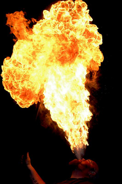
MechaRuffles
- The fire is good, except for the "black" in between the flame and the mouth. The metal bits are more problematic, as they don't really look metal, and finding a pic that was both metallic and in the right shape would probably be a bitch. If you're good with an airbrush, making the metal bits more metal shouldn't be too much of a problem. If not, find some pictures of shiny, curvy metal things, (like that japanese guy who paints robot broads) and try to copy them. Sir Modusoperandi Boinc! 22:17, 30 December 2008 (UTC)
- The fire came from
 and on that image there's also some "black" in between the flame and the mouth. I've already asked a request on Uncyclopedia:RadicalX's Corner for the metallic parts, but as of yet no response. -Sockpuppet of an unregistered user 23:53, 30 December 2008 (UTC)
- Yeah. That black bit has to go. It should be simple enough to just airbrush the metal bits metallic (doing it well, however, is a whole other animal). Sir Modusoperandi Boinc! 00:18, 31 December 2008 (UTC)
- The problem being I only have MS Paint. -Sockpuppet of an unregistered user 01:02, 31 December 2008 (UTC)
- And MSP is the only program in the world? You live in the land of MSP, with MSPians walking their MSP walk and talking their MSP talk? Sir Modusoperandi Boinc! 05:23, 31 December 2008 (UTC)
- Yes. -Sockpuppet of an unregistered user 09:49, 31 December 2008 (UTC)
- From the Tips section above:
Get the GIMP. Like MSPaint, it's free. Unlike MSPaint, it doesn't suck.
- Sir Modusoperandi Boinc! 09:56, 31 December 2008 (UTC)
- So I've heard. I'll try it out, but I can't guarantee it will be with much success. -Sockpuppet of an unregistered user 10:33, 31 December 2008 (UTC)
- 'Chopping is a very different skillset than writing. Sir Modusoperandi Boinc! 10:39, 31 December 2008 (UTC)
- How about this
 -Sockpuppet of an unregistered user 11:02, 31 December 2008 (UTC)
- Um, no. That's just one fade. Picture it in your head in 3D (the old version, in a way, is better as it has the basics of 3D, like the peak along the centerline of the helmet, it's just not all that metalic). The peaks should be brighter than the valleys, upper edges lighter than lower ones. Go rifle through the kitchen and grab a spoon (or, if you have metal cooking stuff with more complex curves, look at those)...or stare at this. When you're done, stare at this. Sir Modusoperandi Boinc! 11:11, 31 December 2008 (UTC)
- Wow. -Sockpuppet of an unregistered user 22:17, 31 December 2008 (UTC)
- Much better. Sir Modusoperandi Boinc! 00:32, 3 January 2009 (UTC)
Santa's army
Well, there are a couple things here. Santa right now has a dark outline around his body, which needs to go. I would use an eraser with a feathered edge most likely for that (if you have a program that has that.). Secondly, I'm afraid there isn't much else you can do with this image. Santa is just obviously pasted on top of a picture of an army. If you were looking to get this one nommed, I would probably try to get santa interacting with an army somehow. This might mean different pictures would need to be used. If you just want this picture to be the best it can be, I would start with that dark outline, and then we can go from there. The Woodburninator (woodtalk) (woodstalk) 17:05, 30 December 2008 (UTC)
- The outline is only bad around the top of Santa, the right side of his beard and the sleeve cuff. A Santa with the elves from that Lord of the Rings movie 'chop is a good idea, but I can't think of an easy way to combine such elements, other than to look at a bunch of stills from the film and a bunch of Santas...and hoping to find a combination that 'chops without looking 'chopped. Sir Modusoperandi Boinc! 22:13, 30 December 2008 (UTC)
- The change you made looks better(getting rid of the outline around the hat. Modus is right though, there is still the outline on Santa's one side. The Woodburninator (woodtalk) (woodstalk) 22:20, 30 December 2008 (UTC)
- You mean at his beard and sleeve? -Sockpuppet of an unregistered user 23:56, 30 December 2008 (UTC)
- The right side of his hat, beard and sleeve all still have a dark band at the edge. Since the material/beard is "feathery", try feathering the edge (and/or anti-alias it). Too much will just make it blurry, so tinker. Sir Modusoperandi Boinc! 00:16, 31 December 2008 (UTC)
Kool-Aid: Jonestown
- Wish there was a higher quality image to work on to begin with :S. 1337D00D 02:20, 28 December 2008 (UTC)
- Aside from the problem that you mentioned, it's not bad. An effect like soften or blur may help minimize the jaggies. Sir Modusoperandi Boinc! 02:41, 28 December 2008 (UTC)
- I personally would find this funnier if one of two things happened. 1) The blub would read "Now with MORE Cyanide!" and/or you could work in that it has a new "look". I'm just thinking that the Jonestown thing was 30 years ago. How do you make it relevant today. Dame GUN PotY WotM 2xPotM 17xVFH VFP Poo PMS •YAP• 21:29, 29 December 2008 (UTC)
- I personally would find it funnier if you would stop sitting on my cat. Watch out! Kitty's got claws, baby! Sir Modusoperandi Boinc! 22:19, 30 December 2008 (UTC)
- So now we are calling it "Kitty" instead of "Little Modus"? Dame GUN PotY WotM 2xPotM 17xVFH VFP Poo PMS •YAP• 16:41, 31 December 2008 (UTC)
- I have warned you in the past that my kitty has claws, right? Mreow! Sir Modusoperandi Boinc! 16:56, 31 December 2008 (UTC)
- So now we're calling "kitty" instead of "Kitty"? Dame GUN PotY WotM 2xPotM 17xVFH VFP Poo PMS •YAP• 17:22, 31 December 2008 (UTC)
- And now, let us bow our heads and pause for a moment of uncomfortable silence..."paws". Heh. Mreow! Sir Modusoperandi Boinc! 23:25, 31 December 2008 (UTC)
- Oh, yes, well you just go ahead and believe in whatever you need to believe in ~hiss~hiss~ and all that. Dame GUN PotY WotM 2xPotM 17xVFH VFP Poo PMS •YAP• 01:07, 1 January 2009 (UTC)
- As far as I have read this is copied off of a "Mad Magazine" article from the 60's. But I doubt that has any relevance.Leo Trotsky 01:56, 13 January 2009 (UTC)
- Probably not, since the mass suicide/massacre didn't happen until 1978. I'm thinking that you may have gotten your decades crossed, hippy. Sir Modusoperandi Boinc! 02:15, 13 January 2009 (UTC)
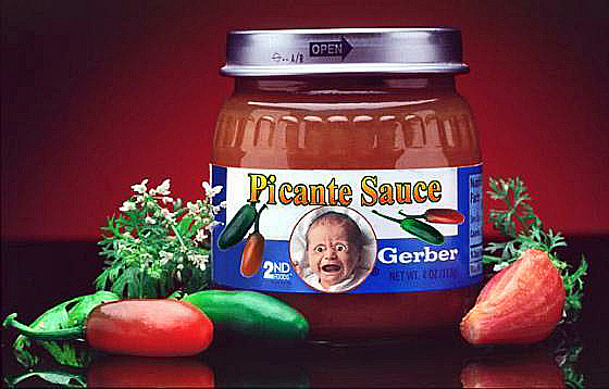
Gerber Jalapeno Baby Food
| Please Help this Picture
|
Introducing the brand-new Gerber jalapeno baby food. Now you and your baby can experience a whole new world of tastes! Image credit: A.Z?123
Nominate - discuss this image
|
|
- Is that typeface for the added text anything like the original typeface? It looks really out of place. Try using higher-res pics of peppers (the red on is looking awfully lumpy). Maybe give the baby a moustache (or maybe not), maybe replace "snap on lid" with "Free Sombrero!" (or maybe not), and maybe 'chop in a picture of salsa in place of the red goo. Essentially, it's spicy, but it doesn't make me feel spicy, y'know? I deserve to feel spicy, damnit! Sir Modusoperandi Boinc! 17:47, 22 December 2008 (UTC)
- Here is my attempt at improving the image. Are you feeling spicy yet?--A.Z?123 16:52, 24 December 2008 (UTC)
- It's spicier, but the peppers still have choppy edges. Are you using MSPaint? Sir Modusoperandi Boinc! 17:29, 24 December 2008 (UTC)
- I am using gimpshop. The choppy edges are due to my shaky hands.--A.Z?123 19:35, 24 December 2008 (UTC)
- Lasso it (or whatever the tool is called), then hold Ctrl & click to deselect areas that you'd selected (and hold Shift & click to add areas). Better yet, get a tablet. Mice suck for what is essentially drawing. Sir Modusoperandi Boinc! 19:48, 24 December 2008 (UTC)
- What if the baby was spitting fire?--A.Z?123 19:53, 24 December 2008 (UTC)
- Then I would highly recommend that the mother switch to bottle feeding. Sir Modusoperandi Boinc! 02:44, 28 December 2008 (UTC)
- Do all the peppers' edges look choppy? To me, only the green one does.--A.Z?123 18:44, 28 December 2008 (UTC)
- The light edge around the red one is a bit choppy (if whatever program you're using has an anti-alias setting for the tool you used to cut it out, turn it on). The green one's edge is a little too blurry, now. It's a fine line between things and other things. Sir Modusoperandi Boinc! 20:54, 28 December 2008 (UTC)
- Still too blurry/choppy?--A.Z?123 19:20, 29 December 2008 (UTC)
- My vision may not be what it used to be, but this version and the one before it look exactly the same to me. Perhaps it's time that you just walk away from this one. Sir Modusoperandi Boinc! 20:30, 29 December 2008 (UTC)
- I think one of the peppers needs a smiley face. Not the yellow round type, but eyes and a smile. Dame GUN PotY WotM 2xPotM 17xVFH VFP Poo PMS •YAP• 21:31, 29 December 2008 (UTC)
- And the circular picture of the baby is a little blocky around the edges. I would definitely smooth that out. The Woodburninator (woodtalk) (woodstalk) 21:34, 29 December 2008 (UTC)
- I really like this one. But then, I like a lot of things...--<<
 >> 03:00, 20 January 2009 (UTC)
Yeah... because nobody's done this before -- Prof. Olipro KUN (W)Anchor Op Bur. (Harass) 06:08, 5 April 2009 (UTC)
Manny Pacquiao in The Three Boxers
| Please Help this Picture
|
Manny Pacquiao has a problem with the other two boxers. One came from the time machine, and the other was a fucking little wimp. The captions are written in both English and Tagalog, as the original was in Tagalog and no one could read it Image credit: Joe9320
Nominate - discuss this image
|
|
- I know nothing about boxing (nor do I want to learn!), but the shadows don't match between the three guys. The left and right guy both need shadows that point toward the camera. Sir Modusoperandi Boinc! 10:17, 14 December 2008 (UTC)
- The original creator forgot about the shadows, sadly.
 |Si Plebius Dato' (Sir) Joe ang Man on Fire CUN|IC Kill
  | 03:07, 15 December 2008 (UTC)
- Were you planning on fixing it, or did you post it here so the original creator could get some feedback? I am confused. --monika 04:42, 15 December 2008 (UTC)
Ubergrue
| Please Help this Picture
|
A rare ubergrue, seen here in it's natural habitat. Like a grue, but bigger, stronger, and more powerful. They are a cross between grues and eurgs. They are made of pure awesomeness and can eat grues/eurgs. But this dosent stop them from eating people. Image credit: That Guy Behind You
Nominate - discuss this image
|
|
Heh, I had to post this. Thoughts? That Guy Behind You 01:08, 9 December 2008 (UTC)
- Did you have to? Really? Sir Modusoperandi Boinc! 03:42, 9 December 2008 (UTC)


